UEA—
UI + UX
Background
The University of East Anglia (UEA) Outreach team, responsible for promoting the benefits of higher education to underrepresented groups, needed to address issues with their 80 page section of the UEA website. The site had grown organically and lacked focused journeys and easily-digestible content. I lead a cross agency team of digital-marketers and UEA user-testers in a design-thinking focused process to solve the issues.
Finding the problems
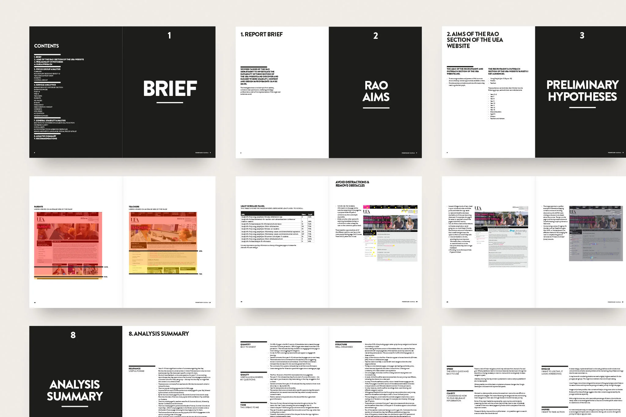
An initial definition of the site’s aims and audiences helped to give the project direction, followed by a process of cataloguing and reviewing the existing site. Combining this information with insight from the Outreach team, we were able to form preliminary hypotheses about where problems lay, and sort these into logical categories for further testing, including relevance, tone, speed and clarity.
Quantitative and qualitative research
A combination of user testing, session tracking with Mouseflow, Google Analytics data and a full CRO and design review of the site showed issues across many areas, including navigation, structure and engagement. An internal report was created to display the results and recommendations, and this became the basis for the next stages of the work.
Test and Improve
Our learnings allowed us to better empathise with the 9 different audiences, and develop unique journeys for each leading to tailored goals.
Prototyping enabled us to quickly test layout options using fast built interactive wireframes, allowing the team to browse as users, and provide valuable feedback on improvements.
Tests lead us to incorporate an additional, tailored menu system that allowed users to filter the section’s content. This ensured that each audience received an experience that felt unique and curated, whilst keeping page count, and related costs, low.
Roll Out
Following several iterations, the final prototype was developed into high-fidelity page concepts, working within the bounds of the existing UEA website technology, structure and aesthetics.
A copy rewrite based on our research findings focused each page on key points, using headings, lead-ins and bullet points to break the text into bite-sized sections. Infographics were created and further imagery and videos added to ensure the final content was both engaging and sharable.
Project credits
Additional reviewing + wireframing: Simon Roddis
User testing: UEA
Session tracking, Analytics review + CRO insights: Fountain


