Gnaw—
Brand Strategy, Brand Identity + Packaging
Background
Less of a brief, and more of a blank sheet - in 2007 two people with nothing but a desire to make chocolate got in touch with the idea of building a brand from the ground upwards.
Looking for a point of difference in a crowded premium confectionery market, we avoided the traditional premium stereotypes and created a bright, playful brand with exceptional results. From the name to the identity and packaging, the brand was designed to make its own space in the industry.
Building on success
8 years have passed since the original branding project, and with Gnaw moving from a start-up to a challenger with stockists all around the world, it was time for the brand to grow up.
The playfulness at the core of the original brand was key to its success, but the visual identity now had to reflect sophisticated flavours, healthier options and be mindful of a growing demand for ethical consumerism.
Sustainable improvement
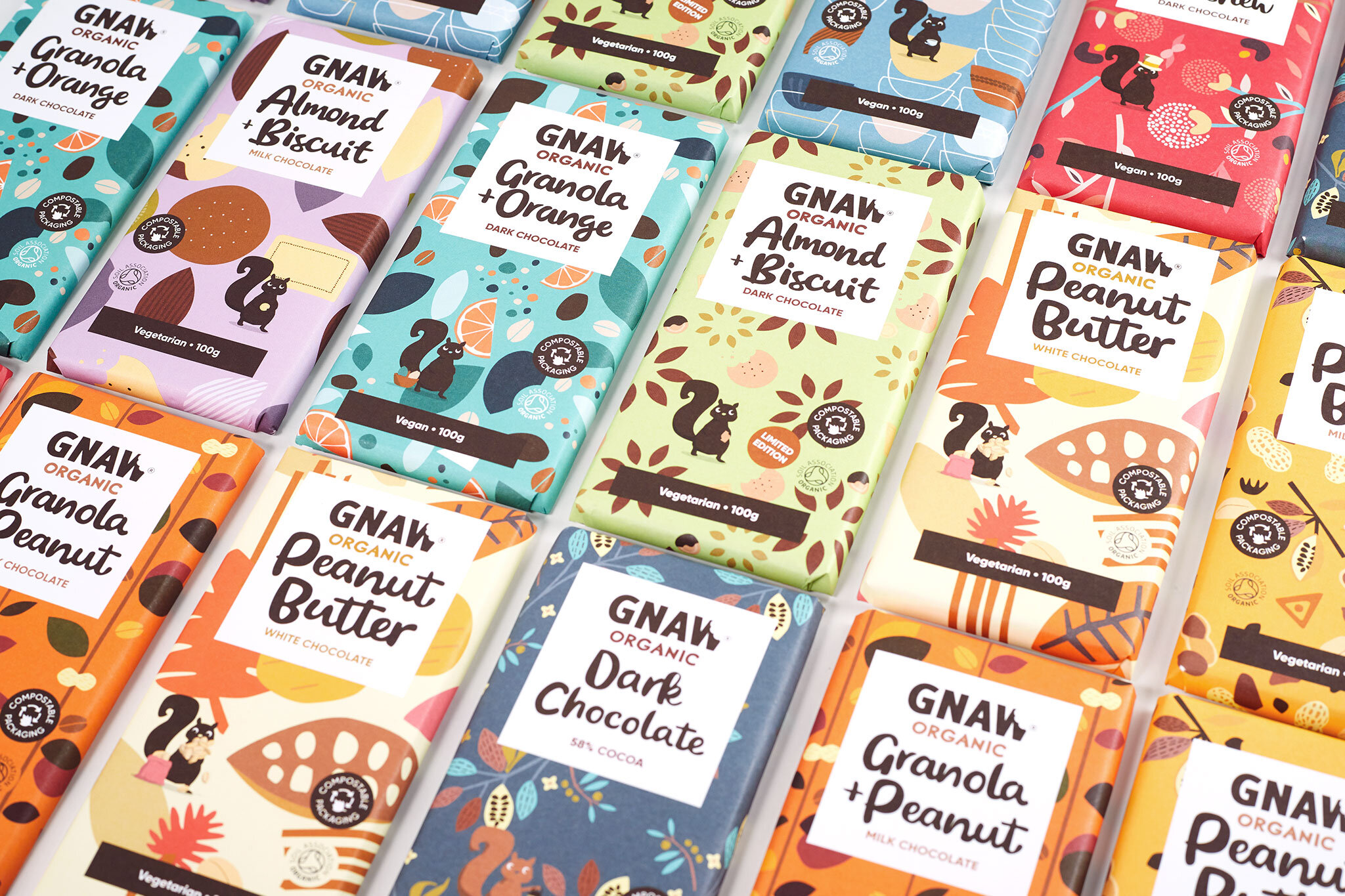
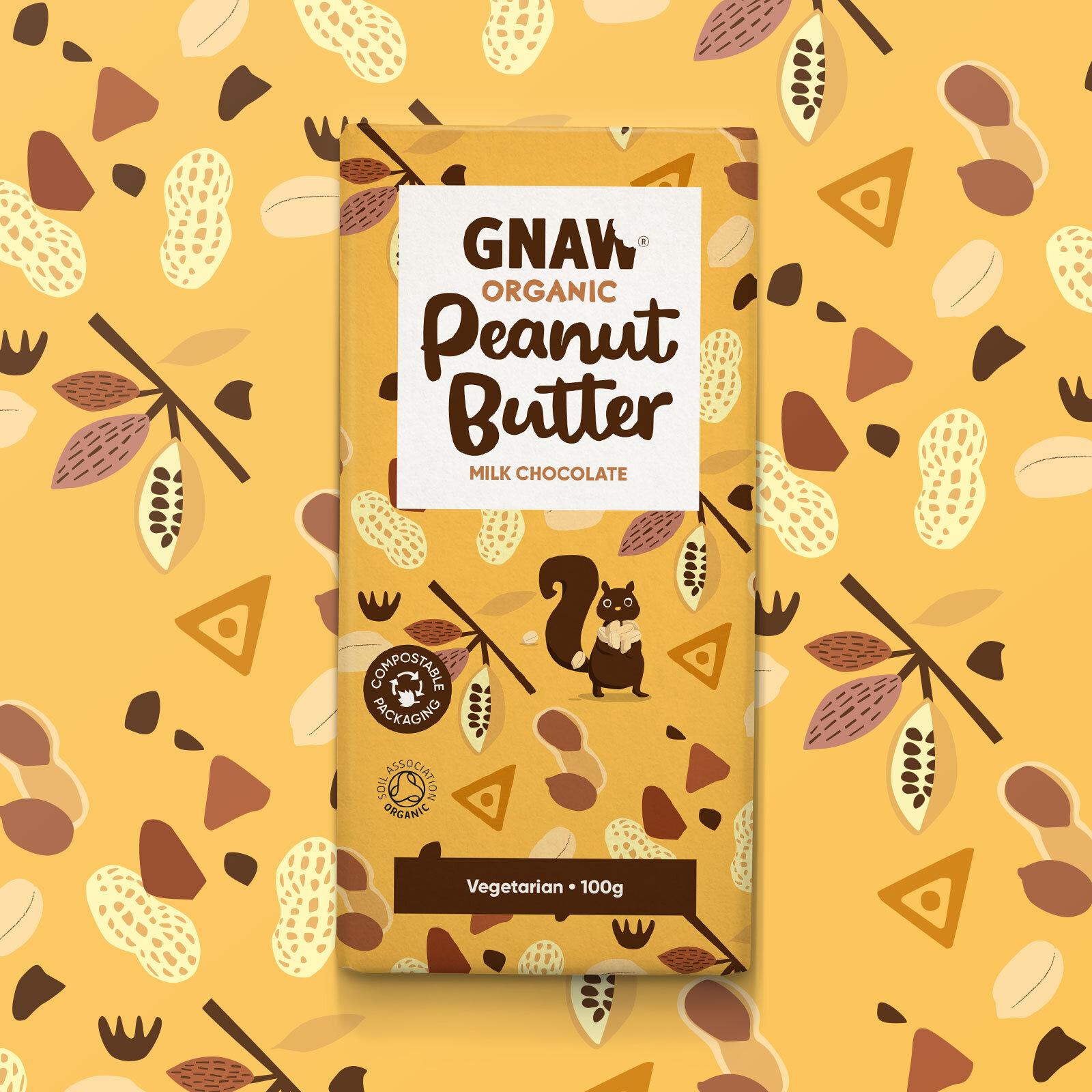
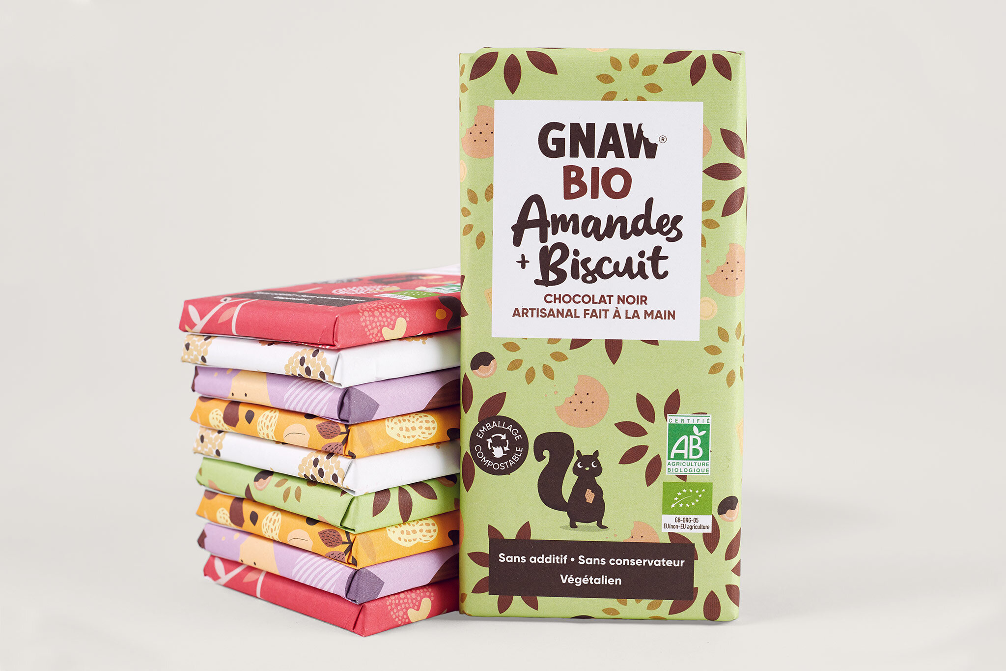
I championed compostable foil wrapping with FSC certified paper, which replaced clear plastic packaging. Eliminating plastic waste was only one benefit; an increased canvas allowed for experimentation with bright, bold, yet organic patterns, which retained the playful but yet signified a more premium aesthetic.
An updated set of Gnaw squirrels was created to bring personality to each of the bars.
The brand refresh was complete with the creation of a delicious bespoke typeface and a highly edible hand drawn script.
Results
In their first 8 years, Gnaw grew from an idea to a £1.4m turnover, and the aim is to keep going.
The new packaging has made a big impression with stockists and consumers, and is being rolled out across further products in a host of international markets including France, Scandanavia and the US.


